CNN sued for lack of captions

US non-profit group sues CNN.com for uncaptioned online video.

Contrast this with schools and universities, who often complain they don’t have the funding to do captioning/transcripts.

Of course, being sued doesn’t mean they will be forced to add captions, or that they will pay any money (other than court and lawyer fees), or that this will cause any change in law.

But if you have a company that offers online video, you should be aware of this, since I believe there is a slow shift moving from government to private-enterprise regarding accessibility and what’s expected as “basic” by the public.

Importantly, neither this news piece nor the link it has to Mercury News mentions what the plaintiffs did before suing. Was there a dialogue with CNN/Time Warner before this?

In the Target case, there was a dialogue, and ultimately Target had refused to work further at some point… that’s when the lawsuit came.

In JetBlue’s case, I don’t know what, if anything, happened there. Was JetBlue made aware? Did people complain? Did JetBlue have plans to fix the problems?

Also as news and other internet junk becomes less local and more global, would say the BBC have an advantage if they were offering captioned videos of the Japanese Tsunami but CNN wasn’t?

Go to pg 4 of the Complaint linked off the DRA page. It says:

14.Defendant captions the video content of its television broadcast programming, but it refuses to caption its online news videos. By refusing to caption its online news videos, Defendant has knowingly violated its legal obligation to make its website business accessible for millions of individuals who are deaf or hard of hearing, and has intentionally presented the video content on CNN.com in a way that cannot be accessed by persons who are deaf or hard of hearing.

Sometimes its a social issue. I am all for accessibility, better is better. but up until 3 months ago I used display:none; in my drop downs… :open_mouth: … I just didn’t know any better. But i do now [thanks stommey!!]

Normally issues such as this are decide d by a free market. In other words, if CNN an its affiliates don’t care about people “those gimps” (clients words , not mine) … its up to “those gimps” (clients words , not mine) to opt for other news sources. After all , CNN is a private enterprise… ( as opposed to government, libraries or many subsidized schools).

But here is the odd thing, people with disabilities are in the minority, even if you count their loved ones as part of that demographic… companies may still opt to think of them as an profitable business overhead as as “those gimps” (clients words , not mine). Aside from the costs incurred in legal representation, the adverse publicity ( marketing… thats where I often come in), of being known by the majority of clients as “that heartless monster who would’t let that poor deaf Japanese child find out about the where about of his mother” tends to have more pull on the Board of Dirs. than the actual demographics who will be using such features.

(14) above is another said ploy… “hey you do it for your on-air videos… WTH??? it’s that hard to add it to your online content!!” :: jury murmurs::

It may seem sad, but without such suits, legal case or not, many accessibility issues would not become relevant to the public at large ( ie those with disabilities ) or , more importantly, to client who PAY for web design.

its up to “those gimps” (clients words , not mine) to opt for other news sources.

Suppose there isn’t another news source. Suppose they all don’t offer it.

Suppose you’re buying a ticket for a show and the only seller is Ticketmaster. Suppose Ticketmaster isn’t accessible to you?

Suppose you’re buying flight tickets for a trip with friends and there’s a group discount number that works with cheaptickets.nl. Assuming you couldn’t use that site, you’ll lose your discount going to another.

Suppose your bank’s site isn’t accessible. Do you switch banks?

You can’t pay your utility bills online… switch utility companies?

The market can vote with its wallet, sure, but that vote is usually very limited by the options available.

And who wants to go to the competitor who costs way way more just because they built their website correctly?

I recently saw someone twot about not being able to sign up for Spotify; he’s blind and the submit button wasn’t available to him and there was a nasty CAPTCHA. He did what most people have to do in that situation: asked someone else to help. It gets real old real fast asking people to help you do things you know you should be able to do yourself. And so what’s the option to Spotify? There are other music services, like Last.fm, but people are choosing Spotify in droves because of things the other music services did wrong… so voting with their wallets, but now the choice has a roadblock.

I guess basically having web sites be inaccessible (for usually stupid little reasons) prevents customers from having the freedom as customers to choose the best product… purely due to the good product’s crappy web page/interface. Inaccessible websites… interfering with the Invisible Hand of the Free Market OH NOES.

So it’s good to try to get companies to fix their sites rather than hoping there’s an alternative. I mean, there is an alternative here… BBC.

I have yet to hear anyone complain about profit loss due to an inaccessible web presence.

I have yet to hear anyone complain about profit loss due to an inaccessible web presence.

Of course not. We’re talking about minorities here, and because they are minorities, they don’t matter, right? If we were talking majorities, that would raise some ears.

And when there’s no competition anyway (only one company offers Service X), either people get others to help them or they don’t participate at all (at which point they are not considered potential consumers… kinda like after you’ve been unemployed long enough, you stop being counted as “unemployed” and are moved to “no longer searching for work”. A wonderful way to play with statistics).

This is why the only way most companies bother changing is because someone somewhere threw a lawsuit at them. Nothing less will do the job apparently.

21st CVAA Mentioned in FCC Report on Changing Media Landscape and Impact on News | Coalition of Organizations for Accessible Technology

According to a report from an FCC working group, “news sites ranked fifth among the 10-most-avoided types of websites due to accessibility issues.” Or so says this article. Interesting.

Not exactly news to me – have you VISITED a major news site? Let’s review, shall we?

CNN – crappy fixed width layout that isn’t even 1024 friendly, absurdly undersized fixed metric fonts on EVERYTHING, 9px? REALLY? REALLY?!? REALLY…. Nonsensical heading orders with missing headings, multiple H1’s…

Faux News – crappy fixed width layout that isn’t even 1024 friendly, absurdly undersized fixed metric fonts on EVERYTHING, 9px? REALLY? REALLY?!? REALLY…. Nonsensical heading orders with missing headings, multiple H1’s…

MSN – crappy fixed width layout that isn’t even 1024 friendly, only about half the elements are in absurdly undersized fixed metric fonts, Nonsensical heading orders with missing headings and NO H1’s… your guess is as good as mine as to what are links and what aren’t as there are NO visual cues on ANYTHING, – about the only good thing I can say about it on the visual front is there are no color contrast issues.

… and that’s just talking visual and navigational issues on those sites – before we get into the idiocy of the code that would confuse the ever living daylights out of someone using a screen reader – like abusing a definition list for a menu? Using legend on what should be a label? Paragraphs and H3’s inside LI? (when there’s no content other than the H3’s?)

Of course, there’s always my litmus test for how well written the code for a site is.

1.5k + plaintext content size * 1.5 + number of object/content image elements * 200 bytes + 100 bytes per form element (INPUT, OPTION, TEXTAREA)

Rounded up to the nearest 1k.

If you’re over that by a significant amount, your code is rubbish – if it’s more than double, do the world a favor and back the blue blazes away from the keyboard.

So, how do the above sites measure up?

CNN
Plaintext: 7.06k * 1.5 == 10.59k
object/images: 24 content images * 200 bytes == 4.8k
Form elements: 4 * 100 bytes == 0.4k
Ideal total: 17.5k
Their total: 101k
Deathshadow Rating: 15/100 - Pull your head out of 1997’s backside.

Fox
Plaintext: 9.83k * 1.5 == 14.75k
objects/images: 45 * 200 bytes == 9k
form elements: 16 * 100 bytes == 1.6k
Ideal Total: 27.5k
Their total: 103k
Deathshadow Rating: 25/100 - Learn semantic markup.

MSN
Plaintext: 9k * 1.5 == 13.5k
objects/images: 18 * 200 == 3.6k
form elements: 12 * 100 bytes == 1.2k
Ideal Total: 20k
Their Total: 109k
Deathshadow Rating: 18/100 - Pull your head out of 1998’s backside.

… and those are some of the BETTER sites. Ever wonder why Yahoo is a laughing stock these days? EVERYTHING I outlined above for visual issues, with this stacked on top:

Yahoo
Plaintext: 3.48k * 1.5 = 5.22k
objects/images: 18 * 200 == 3.6k
form elements: 4 * 100 == 0.4k
Ideal total: 11k
Their total: 226k
Deathshadow Rating: 5/100 – Learn HTML.

There’s a reason I say taking web development advice from Yahoo is like taking technical advice from Forbes or financial advice from Popular Mechanics. For the life of me I can’t even figure out how in Blake’s name they’re even still in business.

Which is why when you mix them with the idiocy of CSS and Scripting frameworks…

Ahahahahahhaha… Deathshadow ratings… this needs to be posted somewhere out of these forums.

Yahoo code bothers the hell out of me… twice as big as necessary even with their “best practice” stuff, in my eyes.

add aljazeera.com to your list! It’s the only news site I visit.

Well, let’s see…

Aljazeera

Man, this is taking it’s sweet time loading – went, made coffee, came back… What is this, am I back on dialup?

crappy fixed width layout that isn’t even 1024 friendly (funny since they’re over by what? 16-24px?!?), absurdly undersized fixed metric fonts on several elements… WHAT headings (oh, this doesn’t bode well)… wow, they don’t even use headings… or paragraphs…

Though really, all we need to say about it can be summed up right here:


<table border="0" width="100%" cellspacing="0" cellpadding="0">
    <tr>
        <td class="mainMenuBG"  >
            <div class="dvMainMenu-left">
                <span id="SiteMenu1_lblMenuLevel1"><table border="0" cellspacing="0" cellpadding="0"><tr class='mainMenuBG'>
<td id='td200779101832373555' class='mainMenuActive'><div id='divMenu200779101832373555'><a id='lnkMenu200779101832373555' class='mainMenuActive' href="/" target="_parent">News</a></div></td>

WOW.

So… tables for nothing, invalid document structures, invalid nesting of block level inside inlines, endless ID for nothing, endless class for nothing, and a total lack of anything remotely resembling semantic markup. Welcome to 1995. Also love the illegible orange on white – such wonderful usability that.

So… how’s the markup it hold up?

Plaintext: 6.35k * 1.5 = 9.53k
Images/Objects: 60 * 200 = 12k
(***** slap, oh snap – no wonder it takes forever))
Form Elements: 4 * 100 = 0.4k
Ideal Total: 24k
Their Total: 157k
Deathshadow Rating: 3/100 (*15/100)

  • -12 points for high image count

Normally the code size would be 15/100, but I take one point off for every two objects/images past the first 48. It’s such a train wreck of useless tiny impossible to see thumbnails you can’t find any content, so the scoring is adjusted accordingly.

To be fair, let’s look at some non-mainstream news sources… Like let’s say one I actually frequent.

OSNews

Crappy little stripe with crappy fixed metric fonts, when visiting the site I use a user.css to override it as I’ve been following that site for over a decade.

Plaintext: 18.7k * 1.5 == 28.05k
Images/Objects: 29 * 200 = 5.8k
Form Elements: 4 * 100 = 0.4k
Ideal Total: 36k
Their Total: 63.8k
Deathshadow Rating: 56/100

How about the legend itself – geeky news at it’s best?
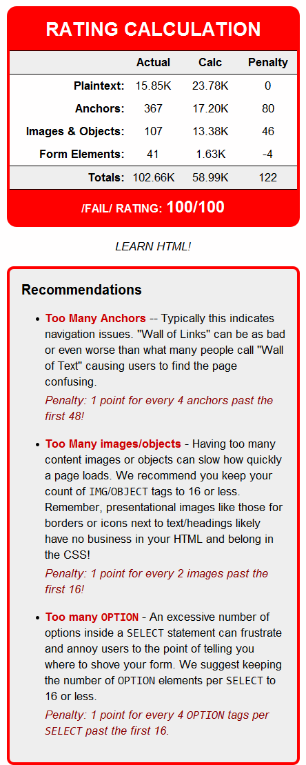
SLASHDOT

Slashdot is kind of sad – six years ago, they were the poster child of accessible websites. Now? They’ve gone to the retard PX metric fonts taking anything that was good about the site (fully fluid, simple layout) and flushing it. I have to zoom in 50% to even make the page usable. (and that’s gonna cost them on my rating)

So… hows’ the code hold up?

Plaintext: 15.5k * 1.5 == 23.25k
Images/Objects: 23 * 200 == 4.6k
Form Elements: 11 * 100 == 1.1k
Ideal Total: 31k
Their Total: 107k
Deathshadow Rating: 28/100

Not so good.

I know, how about

SitePoint – the actual home page.

Crappy fixed width (shocking for a web dev site in the age of media queries), absurdly undersized fixed metric fonts abound, and in a few places the light blue for links has legibility issues.

Plaintext: 6.63k * 1.5 == 9.95k
Images/Objects: 30 * 200 == 6k
Form Elements: 2 * 100 == 0.2k
Ideal Total: 18k
Their Total: 56.8k
Deathshadow Rating: 32/100

Now, to be fair, how about a site I wrote seven years ago before I knew better on ANY of this stuff? Could be good for a laugh.

ClassicBattletech.com

Fixed metric fonts because of some scripting that I should never have let them shove down my throat, and is responsible for the page being very broken which is why the next-gen version is in the wings. I don’t rank the current layout very high because it’s a combination of web-rot and trying to make the website match one of their print products – at a time where I wasn’t actually qualified to do the job right. That’s why it’s a fun example, we all start somewhere.

plaintext: 30.1k * 1.5 == 45.15k
images/objects: 13 * 200 == 2.6k
Form elements: 0
Ideal Total: 50k.
My total: 61.5k
Deathshadow Rating: 81/100

… and that’s before I stopped using tables for layout, stopped throwing scripting at things that were just going to break, before I figured out how to use heading tags properly, was still vomiting up Tranny, was still using javascript INLINED using onmouseover/onmouseout to handle rollovers, was slapping endless classes on everything for no good reason, and on the whole was still basically practicing old-fashioned markup practices. :frowning:

WHAT THE DEVIL are people coding out there?!? But then there’s a reason I often say when reviewing people’s sites “You’ve got 100 to 200k of HTML doing 20k or less’ job!”

For the curious, this is the WIP template for the home page of the new version of the site.

CBT Revision 4 Template

Which let’s review that… dynamic fonts, dynamic widths, scripted assisting for width targets as well as media queries. Zero color contrast issues unless you count the rollover logos (which are just fine once hovered).

plaintext: 4.43k * 1.5 == 6.65k
(thanks to no content cloaking for scripting asshattery)
images/objects: 22 * 200 == 4.4k
form elements: 2 * 100 == 0.2k
ideal Total: 11k
my total: 13k
Deathshadow rating: 90/100*

(* five point bonus for fluid layout with dynamic fonts on content areas)

Yes, I’m such an ass I won’t even give my own work 100 out of 100… that’s how you make your work BETTER.

– edit – oh, all these numbers are AFTER running an ad-block… with adverts it’s FAR, FAR worse for many of the sites reviewed. Images/Objects also only counts CONTENT images, aka ones that use the IMG tag and not ones applied via CSS since those are presentation unless they are image replacements that require several extra hooks for animations (hover items) – any other images have NO MALFING BUSINESS in the markup.

Hey… maybe I should write a bit of PHP to perform this type of analysis automatically? I’d probably loosen up my “estimate” calculation a bit for other people – and increase that 1.5k a bit now that CSS3 is here with media targets.

Though it would be hard for PHP to tell what images SHOULD be counted and which shouldn’t – an important part of the calculation since it’s not just about img or css – it’s about how much code they should take either way.

He he, very nice posts, Jason. I have this urge to say ‘do me, do me’, but I’d probably regret it :wink:

I have to zoom in 50% to even make the page usable.

I do this regularly with almost every site I run into. Sometimes I forget that I do because my main browser will remember my text-enlarge settings for a particular domain so when I go look on another browser I’m shocked for a moment.

Hey… maybe I should write a bit of PHP to perform this type of analysis automatically?

That’s a cool idea, and you could go all out and let people change what’s more important to them (set different “weights” for things like images etc).

Then spread it around. Some ninny will rewrite it in JS or something and make a browser plugin out of it.

It would be called “FAIL METER”. Those of us who are willing to put our own sites under stuff like Cynthia or WAVE oughtta love seeing the results of the Fail Meter.

The icon will totally be a whale.

I’m being totally serious here, this could actually be a standard web dev tool. We rate our competition and then try to get our own scores higher.

Also, this would be cool as a separate thread (except the post rating the news sites would belong on both).

Hi deathshadow could you explain what the individual ratings mean please you lost me on 4.43k * 1.5!!:

plaintext: 4.43k * 1.5 == 6.65k
images/objects: 22 * 200 == 4.4k
form elements: 2 * 100 == 0.2k
ideal Total: 11k
my total: 13k
Deathshadow rating: 90/100*

It’s very simple, I’ll go section by section.

plaintext: 4.43k * 1.5 == 6.65k

If you strip out ALL the markup and just have the plaintext from the page – JUST the text, no HTML tags or anything extra… To use what the HTML specification calls it: CDATA – specifically CDATA from inside BODY that is not inside attributes (like ALT or TITLE). open up a good browser like opera, hit “CTRL-A, CTRL-C” (select all, copy) then go into an editor that will tell you how big your document is and hit “CTRL-V” (paste) to find out how much text you have. There’s 4.43k of “plain text” – 4.43 multiplied by 1.5 = 6.65 – meaning that the markup for the plaintext should only be around 6.65k

images/objects: 22 * 200 == 4.4k

This basically means IMG, OBJECT, EMBED, and to be nice I count PARAM in that too. On a properly written page this means CONTENT images and not presentational ones, since presentational images (borders, logos, graphical representations of text) have NO BUSINESS in HTML. – There is no reason for IMG tags to average more than 200 bytes apiece in all but the rarest of circumstances, so that’s 4.4k just for the IMG/OBJECT tags.

form elements: 2 * 100 == 0.2k

Form elements means tags that are inside a form that the user can interact with – INPUT, SELECT, OPTION, TEXTAREA and BUTTON. There are only two INPUT tags on the page – there’s little reason for those to need more than 100 bytes apiece.

ideal Total: 11k
What the page should probably be size-wise, typically +/- 10%.

The structure of HTML and it’s relationship to the content that’s on the page SHOULD mean that most pages when written properly can have their size predicted if you know how much CDATA, how many interactive form elements are there, and how many images/objects are present. Going past those limits by more than 20% usually means the page is poorly written with endless DIV, ID and CLASSES for no good reason, outdated markup techniques like tables for layout or inlined presentation, or just plain over-thought code.

I’ve been working on a automated tool that loosens up the rules a bit and makes extra allowances for things like anchors – here’s a screen-cap of the same page run through it. Some of the calculations end up a bit different since it’s PHP stripping out the tags and counting the elements using regex.

… and for laughs, here’s CNN

Notice I flipped the rating around so 0 is a perfect page, 100 is total trash… since it’s a rating of how badly it fails. Also notice I’m throwing on a few penalties to address design/structural flaws. I’m probably also going to add penalties for missing or out of order heading tags too before it goes “public”.

Very cool indeed! Look forward to the tool’s release! :slight_smile: