The width of what is there already should be fine. Though I’m now wondering if #successfulsubmit should be made taller because the same font-size issue will probably occur.
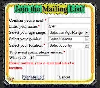
As far as the appearance of #submissionform, I’m just fine for it to look the way it does on your screenshot, with the input label occupying an entire line in width, and then the actual input on the line below it. This way the label will have the entire width of the graphic to make room for even the largest font sizes. I’m also just fine with the submit buttons below the graphic. They do stand out quite nicely, which will entice a user more to interact with the form more. There just needs to be a bit of space between the last input and the submit buttons, so the #errormessage p can be filled when the submission is invalid.
Yes, that’s what I thought might be happening. Our default font sizes are very different, which is something that should be anticipated when coding a page, so this is a good catch .
In my screenshot, the input fields don’t actully occupy the full with of the box, but it certainly wouldn’t hurt to make it wider - even full width, as you say.
Yes, it looks like the #successfulsubmit box does need to be longer. OK, no prob.
Can you please post a screen shot of what a long error message looks like.
Does the user dismiss the error message before proceeding to correct the error, or does the error message remain on the screen?
And will the message in the #successfulsubmit box always be the same? If not, how does it differ?
Do you mind if I make the #successfulsubmit box a little narrower? At its present width, it overflows the edge of the window a tad at the current minimum page width. If you can specify the width of the narrowest viewport that you are designing for at this time, it would help.
This is an error message screenshot. The scripts weren’t behaving right, so I took a few minutes to figure that out so I could post a live example. You should be able to interact with the form now.
The error message will stay there until the user either tries to submit again or clicks the cancel (reset) submit button.
The message inside of #successfulsubmit will always be the same. The only thing that changes is the name input into the message and the e-mail address. ex: “Thanks for joining the e-mail list, Person, under the e-mail, person123456@gmail.com.”
I think the most narrow width to target this design for would be 450-500px. Any lower than that I will need to prepare a flexible mobile design for.
By the way, #invalidemail has disappeared and I’m trying to make it show up. It is the overflow:hidden rules on a couple of sections.
Edit: This little thing may need to be moved elsewhere in the HTML as the overflow:hidden values on #emailbox and #lpfoot is prohibiting it from being animated (it slides out from under #emailbox when an invalid e-mail is submitted).
Never mind this. It’s a separate issue. Just for the ease of things, I think I’ll make the #invalidemail animate upwards. I’m not quite sure why #emailbox has overflow hidden in the first place. Hopefully, I’m not putting sugar in the sacrament here, but I can’t imagine why hiding the overflow would be necessary there- I want #invalidemail to be visible when necessary. The #lpfoot overflow hidden absolutely can’t be changed.
I’ve been mulling a classic design issue. Objects that are displayed on the screen with position:fixed do not scroll… that’s usually the intent. But, if the object might be rendered in a small viewport or if it is filled with text and might be rendered at larger font sizes, the top and/or bottom ends can overflow a short screen and will not be viewable - no vertical scrollbar.
If the objects were allowed to scroll with the page, then zoomed text and small viewports wouldn’t be a problem, but that wouldn’t fulfill your wish to keep the objects fixed in the viewport (the lightbox effect).
The code that I’ve come up with looks fine at “normal” sizes or if zoomed a little larger. It requres a minimum widow height of about 535px - closer to 600px is better - and will look fine in the vast majority of laptops. So, I guess it depends on the minimum height of the screen that you are targeting at this time.
You mentioned that you are considering a complete redesign for the smallest devices, so maybe the version shown in these screenshots will be satisfactory until that happens.
The “submit” and “success” boxes are both vertically extendable.
The space for the error message is hidden unless a message is displayed.
These screenshots show a screen height of 768px. At that height, there seems to be plenty of “flexi-space” in which the user can change his/her settings.
Yes, these will do nicely. For #successfulsubmit, the only tweak I have is that I’d like to put the e-mail address submitted along with the other text above. The red text is supposed to be for a “Click to exit” text to appear. Will it be too crowded in there if I want to have text there that says, “Make sure to check your spam folder!”, or something like that?
One of the only things that remains is the form submit buttons protrude into #submissionform as the browser height becomes shorter. It gets in the way of the nice error message section. It looks as though the buttons may have fixed positioning as they appear to maintain the same distance from the bottom of the window, but I believe it may be just because of the margins. Not sure why.
I changed a very small bit of it as it needed to adapt to the JavaScript stuff. For example, the <p> with a class of .exit needed to have a minimum height added to it so the #successfulsubmit height didn’t “jump” when that was added in by the JavaScript.
The submitbuttons are position:absolute and are relative to the bottom of #submissionform. They shouldn’t intrude into the form at all. If they do, look for some code out of place, or something else overriding my code.
However, I just realized that those boxes do not stay in the middle of the window when the height in changed in the Presto version of Opera. FF, IE8&9, and Chrome are good. But Opera 12 is totally NOT. Guess my testing wasn’t as thorough as I thought. Back to the drawing board.
EDIT: I just downloaded and installed Opera 15 and the code works just fine. I’m not gonna worry with Opera 12.
Before, the top property was assigned a value of 100%. This was the reason it would move around and protrude on the error message section. What’s strange is that using the bottom property instead would make it behave incorrectly… don’t know why that is.
As for the #invalidemail thing that appears when my scripts detect invalid input, I elected to just make the div fade in/appear on top of the emailbox div. Every content container has the overflow hidden, which I don’t fully understand why. Let me know if you like it when you see it.
I think this basically finished for the landing page responsive design. I’ll get started on the home page design shortly, using a lot of the same techniques. I’ll get it fully validated, speaking of the names and i.d.'s not being the same, but I believe I do use the names for the scripts.
Adding {bottom:90px} to #submissionform broke it and made the buttons “float around”.
Why was it added? What were you trying to achieve? Maybe your design intent is different than I expected?
I coded the buttons to move down when that error message box appeared so it would get the user’s attention and so their mouse would not still be sitting over the “Sign Me Up” button.
The code positioning those buttons should not have had to change after the fixed height for the error message was instituted. Your new code for the buttons isn’t flexible… it will not adapt to changes in text height within the body of the form.
I suggest that you delete the changes to #submissionform and .submitbutton and restore the css that I sent (shown below) and the buttons should work properly. If they don’t, please explain exactly how they fail and let me look at the code.
Ah. I know how that got in there. I was copying the new styles into my already existing style sheet in my website directory. That little section remained in there and that’s what went wrong. All fixed now.
I think it’s good to go now and I can start copying this new HTML into my other landing pages. That’s if you think it’s all clear. It’s all validated as well.
As far as I can tell, the code is quite stable and good to go.
It would probably have been easier to add the missing styles into the code that I sent, rather than adding my new code into your existing sheet. The reason is that you could have clicked and tested as your styles were being inserted and checked for bugs. There probably would not have been many to add, either. Just a thought.
Are you happy with the Mailing List box and links in the “footer” section? I have not tested the Mailing List box and the animation associated with it, but the links have a small glitch as the window is being narrowed. Not a big deal at all, but something to look at if you’re interested.
You also realize that you do not have to reserve that space for the error message. The code that I sent is supposed to respond to a JavaScript command to remove display:none and open up the space for that message. The height of the box responded to the height of the paragraph text. A clever feature, I thought. It kept the #submissionform shorter unless an error message was triggered. You might want to reconsider that feature before going live.
Finally, I know you were not crazy about text that became a narrow column beside a fixed image at narrow window widths. I offered some code that would scale the images. The scaling can be handled differently… more easily, I think.
I mention this because, I don’t think the centered text at small widths is especially attractive. IMHO, left aligned or justified would be better. I think we can arrive at a better solultion than center aligning the text by scaling the images down a bit in a fluid fashion. To me, it’s worth experimenting.
Yes, I’m going to re-insert the code for that nifty little feature.
I am interested in finding out more on re-seating the footer content- the mailing list box and the nav links. This would just mean getting rid of #lpfoot? I think they should stay at the bottom of the content, but I don’t know what exactly could be done other than just removing #lpfoot and pushing the elements up into #lpcontent.
You gave me a start! #lpfoot is already within #lpcontent as it should be. Nothing to change about that.
I was just wondering if the animation is working satisfactorily (like I said, I have not looked at it) and whether or not you wanted to tweak that row which includes the links.
Guess I’m asking about three things… the animation at all widths, the behavior of the row as the window width narrows, and the behavior of both items at different text sizes (zooms or user prefs).
 .
.![[FONT=Courier New]#submissionform[/FONT] screenshot](http://i11.photobucket.com/albums/a197/alienws88/submissionformappearance_zpsfe919600.jpg)
![[FONT=Courier New]#successfulsubmit[/FONT] screenshot](http://i11.photobucket.com/albums/a197/alienws88/successfulsubmitappear_zpsc1e67aa2.jpg)