Does colour influence you in Web Design? I have to admit that it fascinates me. I never really fully appreciated just how colour can affect how we react and interact with websites. Do you have favourite colour schemes and why do you stick by them? Do you really believe that colour can make or break a sale? Perhaps it’s over-rated, what about those who can’t see colour? What then!?
Really interested to hear your thoughts on this subject guys!
Yes, I agree Adam - it’s the same for me, lots of strange colour concepts out there, the mind boggles to even try to understand how people can choose such radical colours and pair them together!
I don’t think its realistic to stick to a certain colour scheme all the time - in terms of influencing your visitors, I’m amazed at how much thought some designers put into their logos, websites, branding etc and what affect colour can have on people. It’s a bit embarrassing to think that we are that susceptible to manipulation really!
I’ve seen what google does with some of their A/B testing. They really get into the most minute details–choices between particular shades of color for a toolbar, small button, or tiny icon. It almost seems a bit obsessive
But, I suppose we’re all guilty of that at one time or another for a particular design.
Well that’s true, sometimes I think it’s good to be obsessive but not so much so that you sweat the small stuff, then you know you’ve gotta reel it back in it a bit!
Out of curiosity, what’s your idea of “aggressive” colours? I read that sometimes your colour preferences are determined by your environment - not entirely sure just how extensive that is but if that’s the case I’m totally out of the loop with my blue obsession!
All people are influenced by color, just like all people breath. Even color blind people can see different shades and some color. (There’s a little program called Color Oracle that renders the screen in color blind colors - an interesting and useful exercise)
It’s part of user’s experience and in extreme cases it indeed, can make or break a sale (rather break). For instance, someone would have to make a really good offer for me to buy from a site that has a black background and white font.
Other less extreme cases can also make influence. For example, you’d probably not use a pink color scheme on a website selling fishing supplies.
Most marketers will say that the best color for a “buy” button is orange. Or green for a “download” button. That doesn’t necessarily have a big influence on conversions, that is to say no-one will start buying like mad just because they see an orange button, but even a slight increase in conversions will have an impact on the bottom line.
That brings me to testing. There’s a good reason why someone like Google test like mad, and I don’t think that’s obsessive. The colors will have different impact on different sites, that’s why you really need to test to see what works for you.
Probably color schemes with a heavy dominance of shades of blood reds (or darker), oranges, and splashes of black (maybe as a highlight). I can’t recall any good specific examples at the moment, unfortunately. The website for the Diablo 2 video game comes to mind, but that’s more demonic than aggressive, I suppose.
On the other hand, I don’t see sites with warm or cool colors in the same light.
I’ve noticed that splashes of blue in color schemes tend to be quite common.
Absolutely agree Saul - but it’s unsettling to say the least. It’s like we’re being trained to respond in certain ways to certain colours even though the average person will never truly know that their “choice” whether it be a download or purchase, as you say, was already predetermined by some marketing guru. It has to be admired though in the same breath too.
There was a test for colour blindness before and I can’t for the life of me remember what it was. I know different shades can be displayed but still in terms of web design - this must be extremely difficult and quite admirable really.
When I first started Web Design and knew nothing about colour schemes, black was where I started off. Now it’s like the plague to me but there still are those who are dedicated followers, same with white too - I saw an article posted on a friends twitter feed not so long ago about how effective the use of white space can be on a webpage and how important it is for emphasising layout but it doesn’t really seem to be as popular as it once was. Maybe it’s making a comeback? I see a lot more colour now than what I remember years ago - or perhaps that’s just me. Are web designers becoming more bold with their approach to design, using these “aggressive” colours to make bold statement websites or is there some other underlying psychology involved :sick:
Yeah I’m personally not a fan of dark websites. Seems quite popular with gamers but I guess that’s what they’re used to as most game footage can be quite gothic or “evil” themed - if that makes sense! I guess there’s a bit of colour psychology there too - most gaming websites compliment the gaming environment - stick to what the gamer is used to, no doubt they wouldn’t like seeing pastels
So quite possibly our environment does dictate our taste in colour or perhaps influences us to think in a certain way anyway.
Hmm, I think it goes both ways. Amazon has started using orange for whatever reason, everyone become accustomed to seeing orange buttons meaning “buy”, and next thing you know everyone else is using it. But I suspect surprising testing results on case by case basis.
If you see certain elements to be of a certain color, you start expecting them to be as such. That’s how humans work - you know the sky is blue and you don’t expect it to turn purple one day. And when it does turn purple, you become surprised.
It absolutely does. What’s more important is that there are different environments and some people react differently to different colors. For example, color red will mean very different things in western culture than it does in China.
I suspect they weren’t really talking about white space in the sense that is was white, just that there was nothing there. Designers usually refer to this as negative space instead of white space to avoid that confusion
Not normally, but I played the game Borderlands a few months back, which is a first person shooter meets RPG kind of game, and that use pastel colors quite a lot, and looks good too!
Daemon, I entirely agree with that, I think we are now conditioned on the web to look for green to download and orange to buy because we’ve seen it so much. All the big and credible websites will use the same “palette”.
Black background stands for entertainment, white background stands for work, at least thats the general guideline everyone seems to have adopted, not only in websites but even in electronics and household items.
The reason is even more interesting than that, we as humans can’t fully comprehend the environment we live in, what happens is that ever since we were born, we learn clues about our environment, and their meaning, trying to make sense of our world. It’s as if we live in a illusion of our own comprehension.
For example if a person had upside down vision for a long while, using special goggles, his brain would flip the image and he would see the world around him like normal.
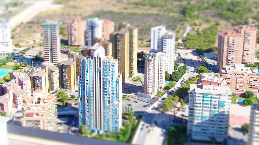
Another example, recently I was playing around with tilt-shift photography where I would make big things look small by faking some of the clues that we used to comprehend the world.
Interesting point is that if someone had never seen miniature cities they would not recognize the effect.
By following the motto that “your visitors spend most of their time on other people’s websites”, webdesigners use our learned information processing skills to present their website in a specific manner, which also explains the common use for blue, which was the original color for links.
In a way the designers are training us, but it’s not the control us, but instead to provide a more meaningful experience, and longer the internet exists, the more meaning colors will have.
(color blind people substitute other clues in exchange for color.)
So by living life like we normally do, we have trained ourselves into treating colors like we do, now it’s all up to research by looking at the most common websites and the real world for the color meaning’s.
I’m horrible at picking colors. Things that look good on a color schemer always end up being too dark a background for text. Now I use the schemer that gives a page example, so I can see the horrors of my ways.
I used to be into really dark pages, because I usually surf late in the evenings (and no, NOT for that :p), but lately I’ve been leaning toward lighter pages.
At the office I hired someone with design and graphics experience, so the burden of coming up with such things is shifted away from me (a good thing) and I can concentrate on the back-end stuff (which I’m only slightly better at, LOL!)
Indeed I think colour does have an influence; just watching Darren Brown somewhat gives an idea of how we can be influenced without really knowing it (though not colour related). As well as the orange/blue combo, once you see it, you can’t stop unseeing it just about everywhere.
On the gaming website front, indeed one of my current personal projects is to theme up a clan forum (a gamer myself). Trying to find inspiration on this front is rather difficult, most gaming sites are dark themes (dark-shades, greys, blacks). Probably because its easy on the eyes to a certain degree, in terms of monitor backlighting - and most gaming, and indeed discussion on gaming is likely to take place in the less light hours of the day (evening and night).
The project is still in the design stage really, while I have a template ready and waiting for some styling already. The colour scheme is the biggest hold up, I’ve even considered allowing people to go ahead and toggle it as they wish within the single theme, or do two near identical themes dedicated to dark and light options.
On a personal front, I really like greens - though its quite uncommon as a colour scheme I find.
For some reason sites that use a lot of red or green put me off but I’m a big fan of blue and shades of blue like sitepoint uses. I was also a big fan of invisionboards default template too.
No idea why but blue shades just seem far more pleasing on the eye to me.
I always pay attention to color when I do anything, even if it’s something as mundane as cooking a dish. The more vibrant the colors are, the more likely people will visit my site even if the content isn’t necessarily the best out there.
Quite true Saul, an interesting angle. Well, let’s hope that the environment of our target audience is surrounded by calming positive colours that will trigger sales for us This subject is amazing, there are so many angles that I’ve never considered before and I don’t think that I’ll ever reach a point where nothing fascinates me about colour and what affect it can have on us!
I love that book Shaun, I particularly love that chapter too - It’s one of the few books I’ve read that I’ve enjoyed in terms of the authors take on colour (well, and everything else, it’s a great book overall) :tup:
Re: white space - yes I know but in terms of the colour white - it’s interesting in itself. Most websites at least on beginner level that I’ve seen always either start off with white or black - that’s really intriguing to me! Most layout containers I’ve seen are surrounded by say “white space” rather than well blue or orange or something.
Do you think it’s a good idea to alter colours and their representations on the web? If we become so familiar with certain colours and their associations, should it really be changed? Isn’t that just making us a bit more confused or is it healthy to create a new outlook?
lol sure sure - you and your late night prowling, it’s all coming out now! :goof:
I do think colour schemes can be really good also, a lot of time saved for me too - nothing worse than getting stuck in a loop with a certain set of colours only to find out a few hours later you were doomed from the get go!
Yes, he’s great TowerRaven - We never can truely appreciate the mind and how it works - I also agree that we are influenced by colour whether it’s subconscious or not I don’t know, I think it’s a bit mixed. I mean, I love the colour blue - if I saw a button that said buy in both blue and then red - I think I’d choose my favourite colour blue. That’s a conscious decision (:
Yeah it’s difficult to try and find a happy medium. I find it hard to stick to a forum theme myself, I don’t like offering the choice of changing around but perhaps if you’re struggling with choosing a theme you’re 100% happy with this is the right option at least for now. As an occasional gamer myself I tend to play in the evening times but I very rarely visit the gaming websites/forums due to the colour scheme being too dark for me - I think including the option to toggle on the light version would be a good idea IMO! See, already colour is playing a part here
Yeah, I saw that later on in the evening on SP’s main page after I posted this thread, great minds I really liked the colour associations :tup:
Mcdonalds uses the colors Red and Yellow to get people the heck out of there. I can suggest not using those colors for your website. Your eyes might just bleed!