I was making one of my test websites. To make Responsive Design before, I used some Grid FrameWorks like TinyFluidGrid. But this is the first time I am doing it manually using target / context = result formula.
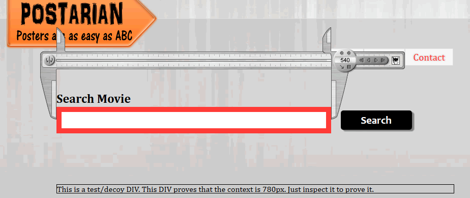
Everything was going fine until I laid a 960 Grid overlay in my page. To my horror I saw that it’s not matching. I am giving an screenshot of my problem here:
Note that the Context is 780px and the Search bar should be 540px (including 10px border on each side, so total: 520 + 10 + 10 = 540) wide. I used the target / context = result formula and it resulted to 66.666667%. Well, not only the search bar but everything there is not matching the grid. What’s the problem?
I am attaching my web files here. Download it and PLEASE PLEASE solve my problem. Code is clean and comment is included, so there should be not problem.I have attached the 960 GRID OVERLAY JQuery plugin. So, just click GRID ON on the top left of the screen and you can see the grid. By the by, I have already torned my hair to solve the problem but I don’t see any reason why that thing is happening.
Forgive me, I am grid illiterate. If the problem is the 2px of width being added to the page, then delete the following border. 100% width plus 2px makes the width of the page more than 100%, thus the horizontal scroll bar and content offset.
I didn’t have any problem making the search bar 540px wide, problem is, it’s not matching with the GRID overlay. Just see my attached screenshot again.
You’re amazing, the problem is solved. How illeterate I am! I didn’t even notice that that border is doing that problem. A huge thanks to you.
(If I face any further grid-layout prob, I will post it here again)
Um. Another problem occured. When scrollbar is being added in the webpage, the grid mismatches with the “SEARCH” button. Just add the following line where the ‘<article>’ ends (just after </article>):
<div style="clear: both"></div>
					<p style="margin-top: 100px; padding-top: 5px; clear: both; float: none">Lorem ipsum dolor sit amet, quas repudiandae ex pro, qui ne iracundia gubergren, quot neglegentur mel ne. Est errem reprehendunt definitionem at, ut summo qualisque has. At eum paulo vituperata. Labore debitis conclusionemque at sea, no sint quas sit. An pro primis sanctus alienum, ius in liber vivendum.

					Illud aeque verterem quo at, no eligendi voluptatum contentiones mei. Duo cu novum aeque pertinax, sonet fabulas insolens quo ut. Sed dicit dictas scripserit cu. Nec ex tractatos adolescens, purto facilisi eam ea. Sint malis legimus sit ex, at ipsum vidisse sit.

					Vim harum possim delicatissimi te. Ne mea laoreet dolores pertinacia, per ei regione utroque, ex cum lobortis intellegam. Ut mel nostro verear persequeris, sit at complectitur consequuntur, eu dicat ponderum his. Pri placerat probatus no, nusquam quaestio disputando mei ex, ad mei impetus tritani aliquid. Ad duis partem possim qui, te est fastidii scripserit, consequat scriptorem nam no.

					An posse iisque abhorreant vim, fierent salutandi sea ut, viris aeterno concludaturque ea sea. In postea nominati his. Ut odio stet delenit has, ei sea malis minim accusata, probo adhuc fugit ius eu. Eu quo suas impetus detracto, diam clita tincidunt te per. Per ut eius falli reformidans, ubique soluta albucius ut qui.

					Ut brute autem eum. Sed errem voluptatibus ut, an pro augue dolor viderer. Homero malorum similique sed ne, et natum postulant deseruisse est, quo elitr delicata ne. Eum cu porro oportere quaerendum, ullum albucius vis id. Posse cotidieque eu vix, alienum pertinacia sadipscing ei eam.Lorem ipsum dolor sit amet, quas repudiandae ex pro, qui ne iracundia gubergren, quot neglegentur mel ne. Est errem reprehendunt definitionem at, ut summo qualisque has. At eum paulo vituperata. Labore debitis conclusionemque at sea, no sint quas sit. An pro primis sanctus alienum, ius in liber vivendum.

					Illud aeque verterem quo at, no eligendi voluptatum contentiones mei. Duo cu novum aeque pertinax, sonet fabulas insolens quo ut. Sed dicit dictas scripserit cu. Nec ex tractatos adolescens, purto facilisi eam ea. Sint malis legimus sit ex, at ipsum vidisse sit.

					Vim harum possim delicatissimi te. Ne mea laoreet dolores pertinacia, per ei regione utroque, ex cum lobortis intellegam. Ut mel nostro verear persequeris, sit at complectitur consequuntur, eu dicat ponderum his. Pri placerat probatus no, nusquam quaestio disputando mei ex, ad mei impetus tritani aliquid. Ad duis partem possim qui, te est fastidii scripserit, consequat scriptorem nam no.

					An posse iisque abhorreant vim, fierent salutandi sea ut, viris aeterno concludaturque ea sea. In postea nominati his. Ut odio stet delenit has, ei sea malis minim accusata, probo adhuc fugit ius eu. Eu quo suas impetus detracto, diam clita tincidunt te per. Per ut eius falli reformidans, ubique soluta albucius ut qui.

					Ut brute autem eum. Sed errem voluptatibus ut, an pro augue dolor viderer. Homero malorum similique sed ne, et natum postulant deseruisse est, quo elitr delicata ne. Eum cu porro oportere quaerendum, ullum albucius vis id. Posse cotidieque eu vix, alienum pertinacia sadipscing ei eam.</p>
Now overlay the grid, and you will see that the SEARCH button is mismatching…
The space between the search text field and the search button is 15px (the margin-left value of the button) + the width of a space character, since these are inline-block elements and there’s whitespace between the two elements. If you want these to line up exactly, this is probably not a good way to do it since the width of a space character will vary with the font size.
It would probably be easier to just remove the whitespace between the text field and the button and set the margin-left value to 20px on the button (if that’s what you want), or maybe set a percentage value instead (20px / 780px) if you want the space between the elements to adjust when you resize the page.
One added info: grid also mismatches with the button and the Navigation bar when you change screen resolution
Please provide the code on doing it perfectly. Unfortunately, I wasn’t able to remove the whitespace between the button and the search field. If I set both of their margin and padding to 0, a small bit of whitespace still exists.
Please note that the Navigation bar at the top is also moving when the scrollbar is added OR resolution changed. Though I have no intention of matching the Navigation system with the grid, I still want to know how to stop the Navigation from mismatching the grid too.
Wow! Problems solved. So that problem was in HTML code? But I want some explanation. Why extra space adds up if you place the SUBMIT button code in a seperate line? I don’t understand? That’s not any paragraph or something else. So why that extra space?
Most important, I wanted to know about the NAVIGATION bar issue. Please read my previous post about this, you are very helpful!
Inline elements and inline block elements should be thought of as similar to words and when one word follows another you have a space between them oryouwouldhavetroublereading. Therefore when using inline or inline-block elements the browser will honour the single space whitespace in the html as it does for text. If you float the element then it is no longer inline or inline block and the gap would disappear but of course that changes the behaviour of the elements so is not always the best approach as you have to take care of other elements (clearing and containing etc).
You can close the gaps in inline-block elements by butting them together but to be honest a display solution should never really be dependent on manipulating the html as you will lose the gap if someone simply reformats the html (as most editors will do automatically). The problem is that the inline-block gap is hard nut to crack. There is a full-proof solution though and you can read the details in a past quiz I set but does require a certain structure to work. The easiest solution is the one you have used with the html but you have to be sure that no one will reformat the html.
Please note that the Navigation bar at the top is also moving when the scrollbar is added OR resolution changed. Though I have no intention of matching the Navigation system with the grid, I still want to know how to stop the Navigation from mismatching the grid too.
Can you post a screenshot of the differences you see so we know what we are looking for. (I’m not very good at noticing the odd pixel difference as I expect that on the web anyway :))
Very nice explanation of the inline-block problem. Thanks for that.
Well, I am currently not facing any grid mismatch with the NAV, it’s strange. Because a few days ago I was facing that problem. Don’t know how the problem got solved. It is true that I re-coded some parts. Maybe that’s why the problem is fixed.
Actually maybe the prob got solved because I also tried CletusSpeckler’s given trick on my nav too, because in some points of being responsive, I had to change the floating elements to inline. So I have to did it to remove the whitespace:
Though the elements are not inline-elements in full resolution (the nav elements changes to inline when under 480px width), but somehow it fixed the grid mismatch problem. Don’t know why. And I am not sure if this is the trick that actually fixed the navigation mismatch.
If in future I need to match a navigation with the grid and if I face problem, I will post about that, because Sitepoint is very resourceful and always helps.