I have mixed feelings about the Medium publishing platform, as it’s another one of those walled gardens where we give all our content to a commercial entity.
That said, there’s a ton of great content there, and it’s a pleasant environment to read in.
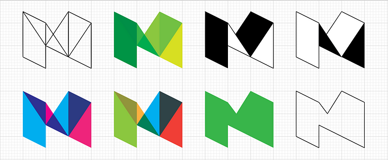
I really liked the original, simple branding, with a logo that evinced a sense of publishing tradition:
I prefer the original - “it does what it says on the tin”
The new one looks like a bit of folded cardboard - I get why the designer was thinking but it looks too arty farty and not about words which is what Medium is all about.
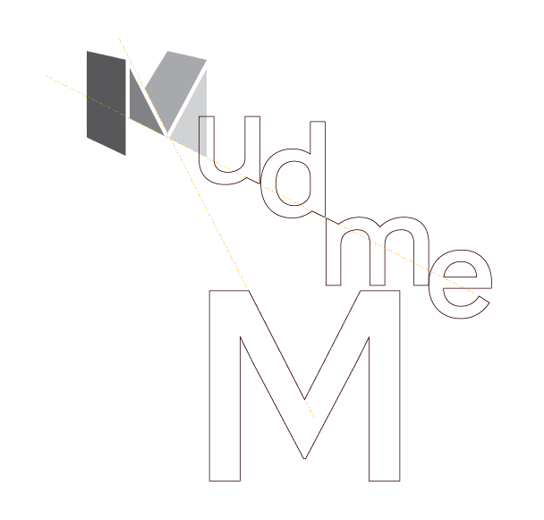
To cap off all this freshness, we’ve updated the Medium logo and wordmark. The new logo better reflects the depth of perspective you can find on Medium.
“Prohibited commercial uses” means, for example, producing letter- or alphabet-themed products for sale using one of our typefaces, or products in which the type is the main visual element, such as a logo or a phrase. This is allowed with an additional licensing fee
I don’t mind it in the grey - which is how it is on their site right now, at least for me.
I don’t guess I see why people care so much? It’s not terrible, and if they wanted or needed to change their logo… so? I don’t think that Medium’s brand recognition hinged on that “M”, personally.
Would argue that the old logo was a more effective brand logo than this new one (which looks like a thrown away version of the Gmail email logo…). Anyone that used Medium would recognize that older logo…this one just doesn’t look as distinct. More of a follower logo than a leader logo…but that’s just my opinion.
I’m not one to put much stock on branding, normally, but to be honest, that older M was a reminder to me every time I visited the site of a kind of “feel” that I like to return to. A kind of literary, publishing atmosphere. This new, insipid thing just loses me. It’s a small thing, but still, I can’t pretend I wasn’t disappointed.
To be honest, when I first saw it I thought it was just a graphic that they wanted to publicize… and then soon after that I just realized that they did change their branding and that perspective M was their new logo.
It looks cool — I am a sucker for trendy colors but I personally prefer the old M. It looked much more sophisticated and ‘booky’ (if that was a term) and felt closer to their publishing service.
The old one was bold, strong, recognisable. I don’t think the change was needed. It was a change for the sake of change - because everyone else does it. Which is how I feel they approached the actual design of the new logo too. Using cool new current styles and colours that are considered fresh. It seems token. And that graphic with justification for the angles? I can’t even handle that.


