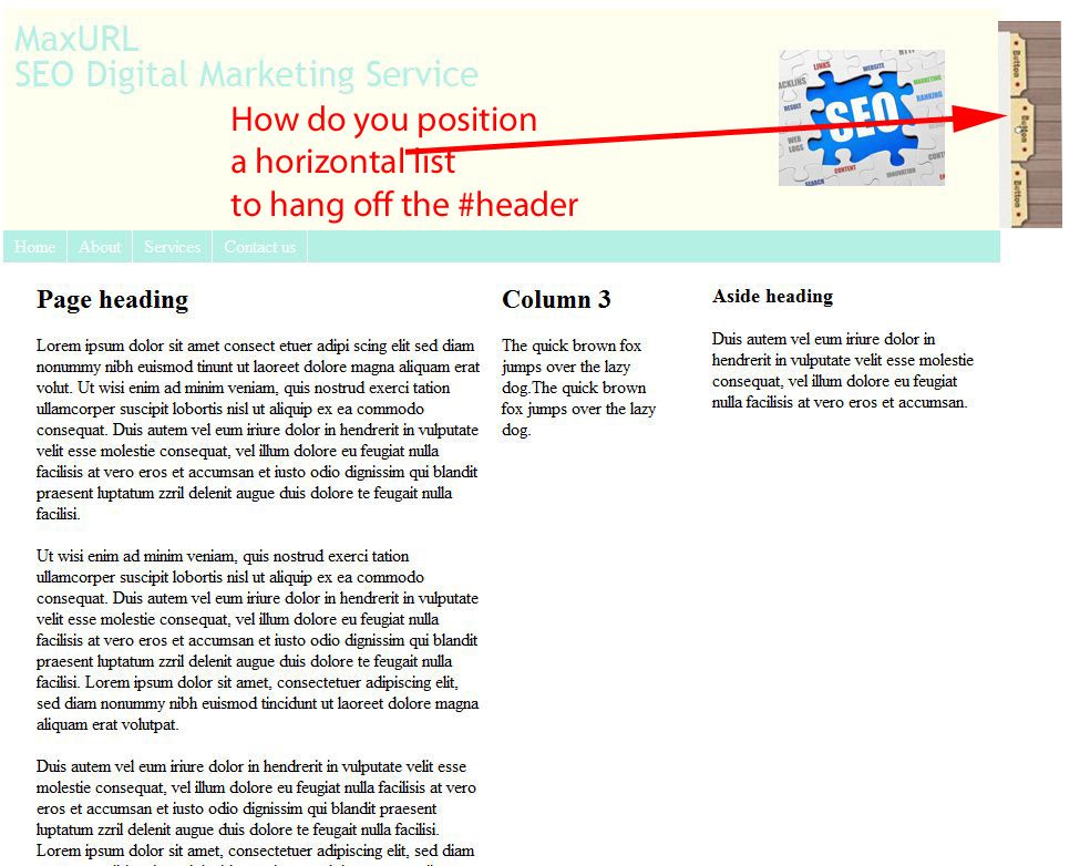
Unfortunately i cant get my head arroung how toi get an <ul> to appear as if its sitting off the edge of the #header. Ive got 1 foggy idea that maybe i’d have to add the ul in the #container and position relatively.
I would position the <ul> absolutely off the side of the header then set a fixed width so the <li>'s stack one over the other, see the following jsFiddle.
From a quick look, I think I would use position: absolute too, but put some right padding on the header, give the header a flexible width (in %) and place the menu in that padding area. Hopefully that would prevent the menu being hidden in narrow browser windows. That’s one of the downsides of having a menu in this position. Unless you are really careful, that menu might be hidden in a lot of situations.
Agree 100%. That’s how Chris’ demo handles the right-hand menu (keeps it inside the header box). My demo follows the OP’s request, but is flawed as you describe. (Knew that goin’ in )
This is revised to incorporate (or recommend) Ralph’s suggestions. Whaddaya think, big guy?
<!--
http://www.sitepoint.com/forums/showthread.php?939674-How-to-position-a-horizontal-tab-layout
Thread: How to position a horizontal tab layout
2012.12.18 05:06
Zygoma (Cheeky)
-->
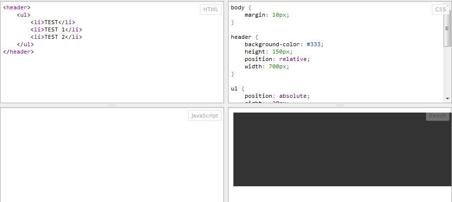
<head>
<title>Menu Hangout 2</title>
<meta http-equiv="content-type" content="text/html; charset=ISO-8859-1">
<meta http-equiv="content-language" content="en-us">
<style type="text/css">
.container {
display:table;
margin:0px auto;
}
.header {
background-color:#ffa;
width:600px; /* unit of measure to be determined by author with responsiveness in mind ? */
height:220px; /* height to be determined by contents ? */
position:relative;
padding-right:2em; /* padding to prevent contents from sliding under the right-hand AP'd menu. unit of measure depends on construction of right-hand menu. */
}
ul {
list-style-type:none;
padding:0;
margin:0;
position:absolute;
top:10px; /* unit of measure to be determined by layout */
right:0;
}
li {
display:block;
border:1px solid #b86;
background-color:#fdb;
text-align:center;
line-height:1;
padding:.4em;
margin:0;
}
.content p {
}
</style>
</head>
<body>
<div class="container">
<div class="header">
<ul>
<li>o<br>n<br>e</li>
<li>t<br>w<br>o</li>
<li>t<br>r<br>e<br>e</li>
</ul>
</div>
<div class="content">
<p>Lorem Ipsum lives here.</p>
</div>
</div>
</body>
</html>
Of course, the problem with this approach is that the right-hand menu no longer appears to be hanging out to the right of content beneath the header box. Using the first solution plus padding left & right in .container would solve that.
Yep, better. Here’s a quick attempt to get rid of the color overlap, and to put a flexible width on the layout (to help prevent the menu getting hidden in a narrow browser):
Great. Quick question: .header is a block element… does it actually need {width:100%} declared?
Although I posted .4em for the padding around the list item in example 2, I would personally use pixels (as in example #1) because I would not want those suckers growing any faster than the font when text only is zoomed.
