Yup. Just check the post before yours ![]()
I do apologize because I never got to finish mine. I was pretty busy and I could dedicate a short amount of my time ![]()
Before the bashing begins… ![]()
No, really, I’m OK with any comment, you have my word. ![]()
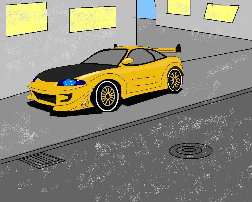
My design has the bussiness card concept: two cards, one with the face up and one with the back up. Maybe the colours aren’t quite the best.
Best viewed: FF4 (beta at the time), Op 10.63+
Worst view: Ch (10 at the time), Saf
No feeling at all: IE7+ (IE9 RC at the time)
No CSS: IE6-
That’s how I stack my UAs too.
I think my design shows pretty well who are the champions of CSS3 so far. That was the purpose. Webkit may be fast (?) but it lacks in finess, as always.
FF it’s my personal browser of choice lately. Since 3.5. I used to be a Ch addict. No more.
Op is always promising, but I always find a JS rendering bug and lag every now and then, and the settings are not quite user friendly and intuitive. Otherwise, I would use it first before thinking about IE9.
How much time I spent working on it? Well, I started the last friday, before extension. Continued the following tuesday, a bit, and finished the next friday, before the contest ended. Probably a day’s worth of time. It was hectic at work, I wish I had more time.
I will start with what designs I find interesting, in alphabetical order:
aniketrk
Hueij
nizamilputra
Pikacsu81
Special notes: Pikacsu81, quite a branding effort. And funny: the big fish turning! Hueij, a solid design. And also funny: MS Paint!
The purpose of design with CSS is to achieve an effect w/o the CSS code being obvious at use. As little CSS as possible, and in the right place. Too much CSS and it starts to look like Jocelyn Wildenstein. I believe both Pikacsu81’s and Hueij’s designs are true to this “CSS in the right place” concept and don’t go overboard, while the look is consistent.
Markup and code appreciations later.
I don’t know what to make out of zcorpan’s.
Some great work there
(looking from my design taste)
aniketrk fancy lookin
ohhh LePhuronn, I like your style.
Pikacsu81 boo indeed
tkrster yours almost crashed firefox, takes 6 seconds to load the page
transio especially fancy in chrome
Ryan, you got the cloud to move in firefox but not in safari??
zcorpan just wow, totally unexpected, great html5 example document I have to say.
noonnope would fare better if it was more usable
Molona nice and pretty
Guido clear and clean
Eric j, not too usable.
Scallio, hmmm, decent
Mittineague eye tripping
Paul LOL, looks like you had the most fun here, the newsletter was the most surprising, very nice tech demo, and surprisingly clean html for the amount of features, and how did you make the background so striped, will have to analyze for a while.
Now let’s judge the out of competition entries, who gets what place ![]()
I say:
- Paul (talk about going overboard LOL!)
- Molona
- guido2004
it’s gonna take me ages going over each one’s special features, and yes I was also extremely busy with work, but you can always find the time, when eating, when resting, during the evening, or even in the bathroom.
p.s. What about the 3 example entries? they also need to be featured with their creator name.
p.p.s. oh and do we get the pretty little icons next to our avatar/name?
I don’t know what to make out of zcorpan’s.
Hee hee. Awesome.
I suppose the three examples should be listed as “Staff entries” as well : )
Looking through the list, I noticed the high number of “broken”-looking sites simply because of @font-face. Now, for this contest that’s ok, because you could do a lot of cool things with @font-face. But I think it gives people a good idea of how badly is works without a fallback in the rest of the browsers.
awesome indeed. ![]()
yes, after all they also put in work, and I think I know who made the “coder” one
which is why I decided not to use it at all for the text of the website, where a fallback was not possible.
Generally I think it’s best avoided unless it really shines and has a fallback of some sort (what you said).
…wait, was mine broken?
So Candygirl what will you be drinking from the cup and do we get to see a picture of you in your new SitePoint T-Shirt when it gets shipped? ![]()
Either the top three people are being modest about not being ‘designers’ or have some other hidden talents? Like I said from the beginning this wasn’t just a ‘design contest’ and that you didn’t need to be a designer to be placed high. My word, was my bond! ![]()
Having artist flare would help a lot, you also had to pay attention to the markup and other items as the competition would be fierce. Therefore if there were loads of ‘cool designed pages’ but not many with good markup. Then obviously the ones with better markup could have an extra benefit by gaining in that category. Same with browser compatibility if it fell to pieces in a modern browser it may have suffered.
So having a good solid foundation in markup would help. As you were all aware I was one of the judges and my magnifying lenses would see what was lurking underneath at source code level. ![]()
…was obviously the strongest basis of judgement, as specified in the rules (it’s a markup competition, not a design competition)… so no one should be shocked that some of the best designs didn’t even place.
Why thank you YuriKolovsky.
I very much like your bold use of typography and overall layout, and your attention to detail in recreating the Facebook and Twitter logos is fantastic.
I’m not mad keen on your background gradient though if I’m honest, but other than that very well done!
I’d also like to extend my congratulations to all participants for a job well done.
Third, not bad for 2 hours work.
Thanks Yuri ![]()
imaginekitty’s source is beautiful!
Off Topic:
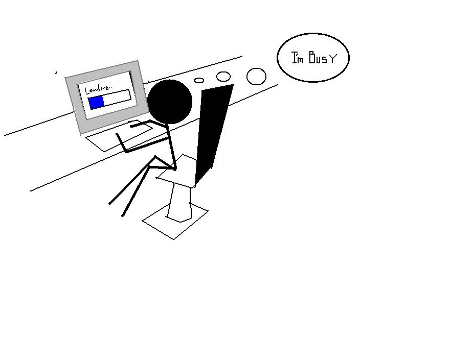
At some point I had the “microsoft paint” part of text in a rainbow color where each letter had a varied size and was blinking, I mean it’s fun to make fun of m$ paint, but I also have a special place for it in my heart as a very challenging medium to work with, you can’t spell “Microsoft Paint” without “Pain”.
a small tribute to Microsoft paint, here have a laugh.
1 [URL=“http://i119.photobucket.com/albums/o126/yurikolovsky/BobaFettsmall.jpg”]2 [URL=“http://i119.photobucket.com/albums/o126/yurikolovsky/Jediknight2.jpg”]3 [URL=“http://i119.photobucket.com/albums/o126/yurikolovsky/Iceman.jpg”]4.1 [URL=“http://i119.photobucket.com/albums/o126/yurikolovsky/IcemanNight.jpg”]4.2 [URL=“http://i119.photobucket.com/albums/o126/yurikolovsky/Busywithcomputer2.jpg”]5
![1 [URL=“http://i119.photobucket.com/albums/o126/yurikolovsky/BobaFettsmall.jpg”]2 [URL=“http://i119.photobucket.com/albums/o126/yurikolovsky/Jediknight2.jpg”]3 [URL=“http://i119.photobucket.com/albums/o126/yurikolovsky/Iceman.jpg”]4.1 [URL=“http://i119.photobucket.com/albums/o126/yurikolovsky/IcemanNight.jpg”]4.2](http://i119.photobucket.com/albums/o126/yurikolovsky/Alwayscocacola.jpg)
haha np guido
Thanks for the kind words Yuri. I really like the clean and straight forward design you did, and it is amazing the resemblance of the twitter and facebook logos ![]()
I’ve been truly impressed with the designs in general and all the work every participant put into this. I hope that I can have new ideas from this contest, and learn something new from here. ![]()
My only complain is that I don’t get the cup for being in the second place… of the “staff entries”… it is so hard to compete against Paul ![]()
Yuri. The cloud is moving but just so slow you can’t see it. I set the speed very low and it’s perfect in FF but it’s too slow in Safari.
I decided that instead of increasing the speed, I’d leave it be. I didn’t want it to be distracting.
Yes, I just had a bit of fun with it. Nothing serious and all over the top.![]()
I’m not a designer as such so I just throw code at it until something happens or it looks better than it was. The diagonal gradients really slow the page down though in Firefox. My favourite part was the ugly fish in the contact section (safari or ff4 only) - and the fluid table.
I’m impressed with all the entries as there was something in each that I liked and I’m glad I didn’t have to judge.
Congratulations again to all those that entered and made this more interesting.
I enjoyed the comp, it was my first venture into HTML 5 having been using XHTML up to now. Since the comp I have been swatting up on HTML5 and CSS3 and have started to incorporate into my sites ![]()
Just wondering if anyone has hovered over my fish yet? It has a little easter egg, but works best in safari and chrome.
Thanks for the chance to take part, and well done to all the winners ![]()
@Ryan, ah now I see it.
LOL I missed that one completely.
@Logowizard yeah I noticed it ![]()
Mine has little title attribute jokes scattered around it ![]()
@ Paul O’B, just seen your fish… you’re right it is ugly, but fun all the same ![]()
Yes, Graham we noticed the fish and it’s ‘trick’. We liked many of humorous or unique aspects such as that and Ryan’s moving cloud… or the blinking text in Jaap’s tribute to MS Paint.
Even some of the funny title text; like in Tim’s social media icons, or Csaba’s moving fish, etc. There is plenty to keep you entertained within the examples and it’s nice to see how different people tackled the challenge. ![]()
and how they all approached it differently. Some fantastic designs and examples of HTML and CSS at it’s best.